What The Acqui-Hire of Sparrow, Pulp, Wallet etc might tell us about Tech Entrepreneurship

Today, there were some buzz in the tech world about the acquisition of Sparrow by Google, Pulp and Wallet app makers Acrylic by Facebook. Getting their company acquired by a larger company to make their products bigger and stronger is a dream for most entrepreneurs. You can see from these posts (here and here) that these acquisitions (and many recent ones) were not really acquisitions but a hiring of the talented team behind these apps.

The customers are obviously unhappy about this since the products will get shelved and they might have no support or upgrades in the near future.

As an entrepreneur myself, I feel that entrepreneurs are in a tough spot. I understand how tight the money situation can be when you are building a product. If entrepreneurs who have built very successful products like Sparrow have to abandon their products to go work on other products at a larger companies, is the path for tech entrepreneurs very bleak?

My gut feel is that the tech economy where users expect most products to be free is partly responsible. Most web and mobile apps are expected to be free. If they even cost a dollar, they have to cross an extremely high bar in terms of customer expectations to be popular.If they have even the smallest of bugs, negative reviews on the stores can sink the product.

The app store model means that you pay once and get lifetime upgrades free of cost. New versions of the mobile operating systems come every year (for iOS) and every six months (for Android). The developers have to create updates to ensure that the app functions well under the new OS. But they won’t get any extra remuneration for the extra effort spent for the latest release.

So it makes sense that the founders having worked on their products for 2-3 years realize that they are better off being part of a larger company where they have better control on their financial life.

Unless, another explanation is that the larger company made an offer that they could not refuse. If you know which one it was, please let me know! As of now, I am going with the former.

Some hidden good and bad iOS5 features

Now that I have spent sometime with iOS5, I am finding that there are many hidden features (including apps) and some annoying changes too.


The first of the annoyances have to do with the Twitter integration with iOS. When you read about the integration, it sounds like a good thing (it probably is). But if you are someone who has multiple twitter ids to manage, the management of multiple ids has been taken out of the twitter app into the main settings app. I do not understand why something should be made harder when it was easy to begin with.


Another annoyance is how one has to get rid of notifications. So iOS has copied the Android notification feature. You swipe down on any screen to bring up the notifications and weather screen. So far so good. If you have apps like NYTimes installed, you will find breaking news alerts included in the notifications (breaking news from two days ago? It stays until dismissed or more breaking news comes up on top). You see an “x” on the top which indicates that you can dismiss these set of alerts by tapping on it. NO! Tapping the “x” brings up “Clear”. You need to tap clear to clear the notifications. I wonder why we need a two step process when one step will do. (This was probably done to prevent accidental dismissal of alerts, but it still is an annoyance).  Similarly, the “Mark as unread” in email has become a two tap process.


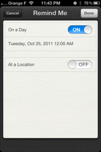
Now that we got rid of the annoyances out of the way, we can talk about some cool features. One of them is the location based reminder feature embedded in a new app called “Reminders”. You will get this app preloaded when you install iOS 5. You can schedule a reminder to remind when you reach a particular location or when you are leaving a location. The only catch is that you have to choose the existing addresses in your addressbook. You cannot add a new address into the reminder (bummer!). But it does pick up the current address. So you can setup a reminder for when you leave or arrive back at the current location (on the same day or a different day).


The reminder can also remind you if you want to be reminded on a particular day/time. Somehow this is not linked to the calendar.


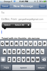
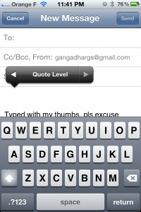
The other new feature is the option for indenting your email. To get this feature, double tap in your email editor as you would to enable copy, paste functions. The copy, paste functions come up with an arrow pointing right. Tap this button and you will access the “Quote level” option to choose what quote level you want your email text to be.

iOS 5 upgrade issues and a cool feature

Apple released the long awaited iOS 5 update yesterday. I wanted to upgrade the iOS version on my iPad and iPhone since I wanted to take iMessage for a spin with my friends all over the world. I started the upgrade process last night and it finally ended this afternoon. I am writing this blogpost to share what I learnt. I hope this will smoothen the upgrade for you! (In this post, when I refer to iTunes, I mean the iTunes on your computer).


Make sure that you are ready to give this process at least 3-4 hours (apart from the iOS download time). Since I tried to download iOS on the first day, I encountered multiple problems in downloading and connecting to the upgrade server. Hopefully these errors are now resolved.


I am going to skip the obvious steps like connecting the iDevice to iTunes, then choosing to upgrade the iOS version on the device.


Before you upgrade the OS, ensure that you take a backup into iTunes. The backup should take place if you do a complete sync of your device with iTunes. This is important since the iOS 5 upgrade process is not the smoothest.


After the download is complete, you will notice that iTunes restarts your iDevice a couple of times. I did not count mine since I left iTunes to its devices. Let it complete the process. IMPORTANT: Before you unplug your device from the computer, ensure that the restore process is complete on iTunes. This is a change from the normal process where the device displays a sign that it is syncing with iTunes. Here the device will act like normal but iTunes will still be restoring from backup. If iTunes shows that it is restoring from backup, let it complete.


In my case, since I disconnected the iPhone from iTunes while the restore was still on, many of the apps were in some sort of a limbo state. The App store on the iPhone showed that I had 40 apps to update. When I tried to update them, all of them hung with a waiting sign. The app store went back to proclaiming that all my apps were updated!


I took a picture of the screen at this point so that I could figure out what was going on. I lost that picture later (you will see why).


I had to go to iTunes, update all my apps there and then connect the iPhone to iTunes to sync up all the apps. It claimed that it updated the apps but the apps were still in “Waiting” mode.


I also noticed another change. The apps were scattered all over my iPhone instead of their normal folders. This coupled with the apps in “Waiting” mode made me realize that the I might have to restore my iPhone from its backup.


So I went ahead and restored my iPhone from its latest backup and then all the above problems went away. This time, iTunes did complain that the previous restore process was interrupted. This also meant that the picture that I had taken of all my apps in waiting” mode was now gone.


I had to set up iCloud and the iPhone a couple of times. But it is now lesson learnt! When I upgraded my iPad, I did not mess with it when iTunes was restoring from backup. The backup restore process alone took about an hour.


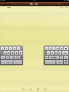
When I used the iPad with iOS 5, I noticed a cool new feature where you can undock the keyboard and split it into two. You press and hold the hide keyboard button on the keyboard and it brings up two new options “Undock” and “Split”. Using these options, you can make the keyboard hover over your text and split it where you need extra space. Once you split or undock the keyboard, it stays that way in other apps too.


If you have uncovered any such undocumented features, please include it in the comments. I will update the post if I find any other tips or features.